In this lesson, we will discuss the topic of charts in Excel and all the processes related to them, with a full explanation using live examples.
Assuming we have the following information table.
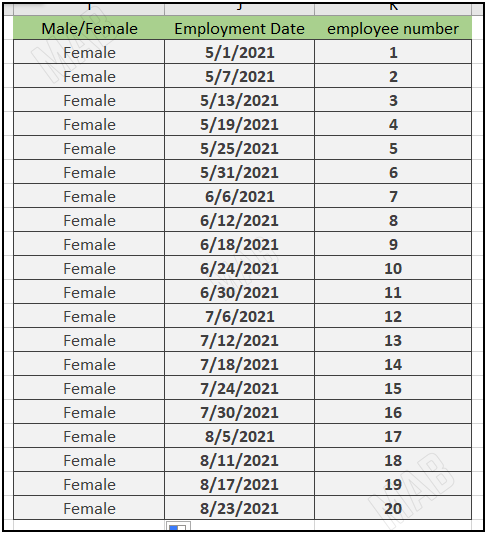
There are several ways to filter the information in this table so that we choose to show only certain information and hide the rest of the unimportant information.
The first method: filter information using the Sort & Filter option in Excel
1- Click anywhere in the information table.
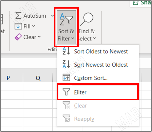
2- From the toolbar and from “Home” we choose “Sort & Filter”, then select “Filter”.
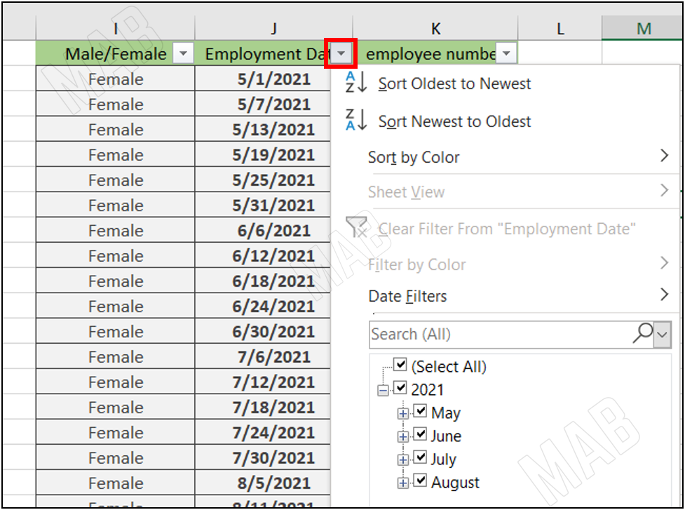
3- We notice the appearance of small arrows next to each title, when we click on the arrow a drop-down list appears.
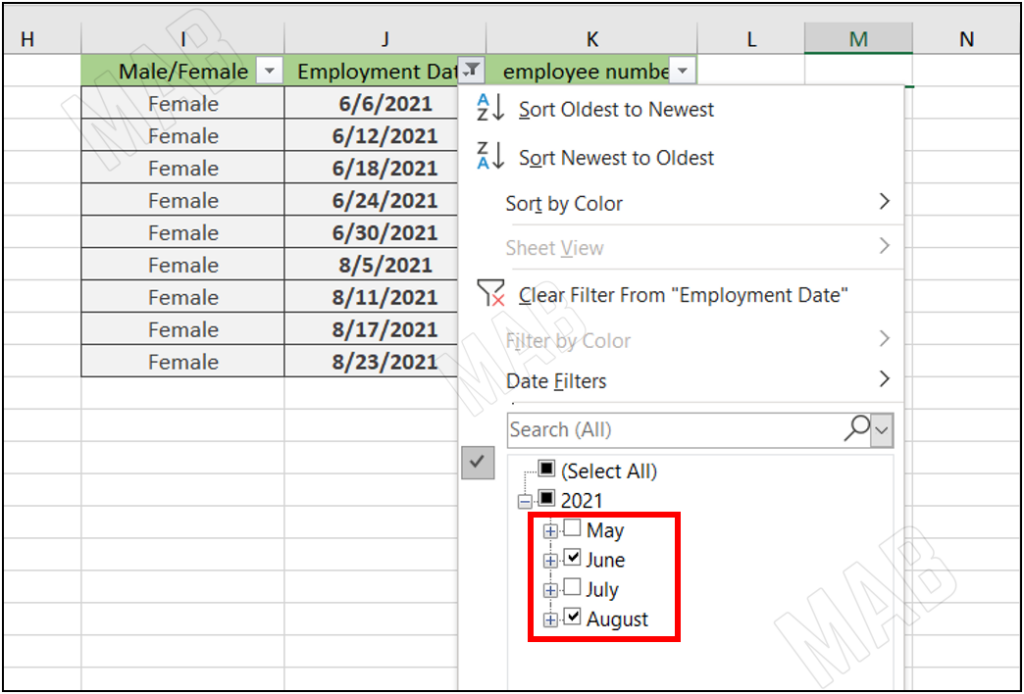
4- Through the list that appears and by selecting and deselecting the boxes we can choose the information that will appear.
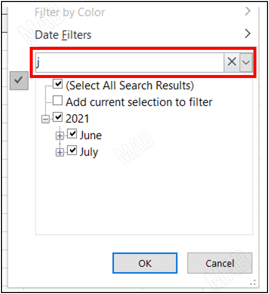
5- We can also search by number or name, by writing it in the search box in the drop-down list.
The second method: Filter the date in Excel
6- To filter the date, we click on the arrow next to the date.
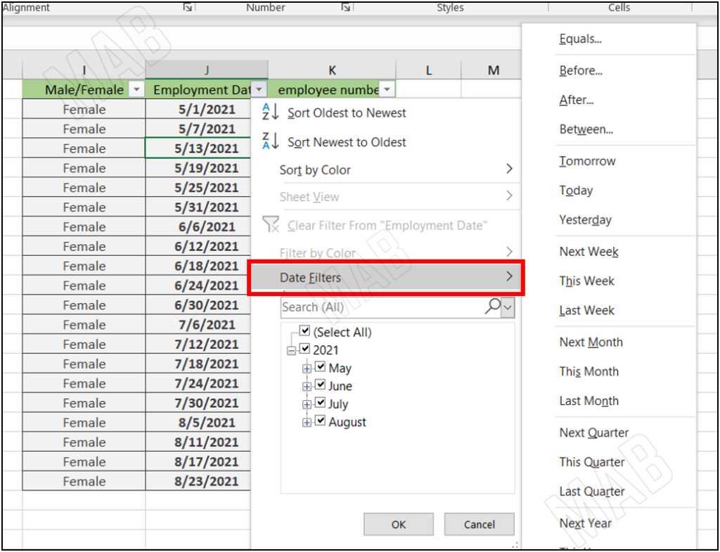
7- We choose “Date Filter” and from it, we choose the appropriate option for us.
The third method: Filter information by color in Excel
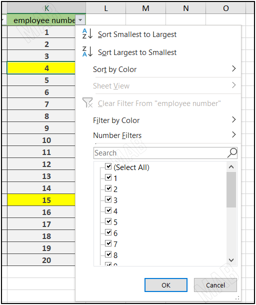
8- To filter information by color, click on the arrow in the column containing colored information.
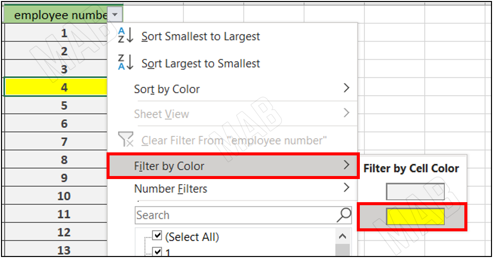
9- Choose the option “Filter by Color”, and specify the color of the information, which is yellow.

Dear reader, if you liked the article, do not forget to subscribe to our YouTube channel, which provides all new in the field of technical and completely free training courses.
You can also browse our website to access the blog and read technical topics, or learn about the training courses offered by the site.
To access the full course “Excel Course” on YouTube, click here.


